BRANDING
ACCPremiere Brand Design
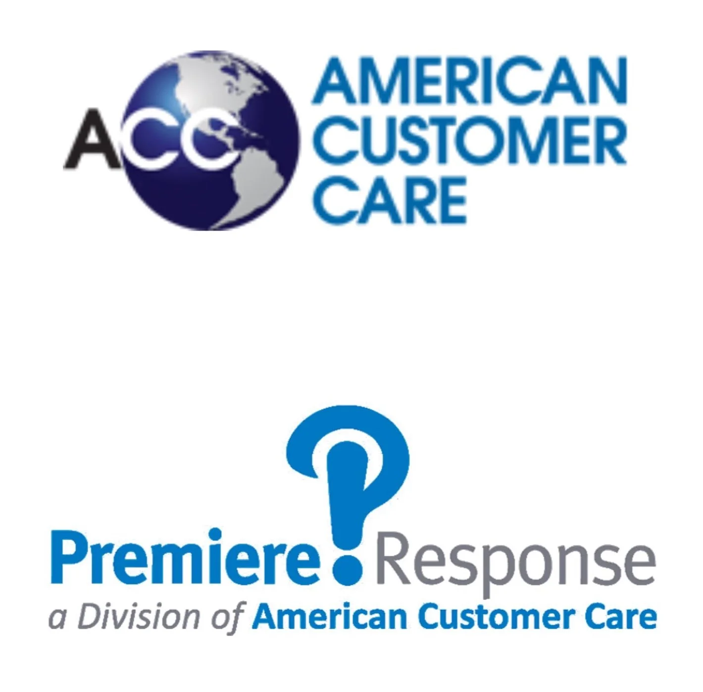
Original brands pre redesign
The objectives of the brand redesign:
Combine the 2 existing brands/companies and create a single brand statement
that speaks to both properties and audiences.
Provide users with a unified and consistent brand experience.
Elevate the brand to compete more favorably with new players in the space
Competitors in the CX space are touting advanced technology and AI.
ACC/Premiere brand needs to present a more modern and advanced attitudeThe existing brands (Premiere Response and ACC) may appear as second tier
when compared to newer competitors. The new brand needs to live on an equal level
Competitive Evaluation
A review or major brands in the space was conducted to set a standard the redesign must meet and exceed.
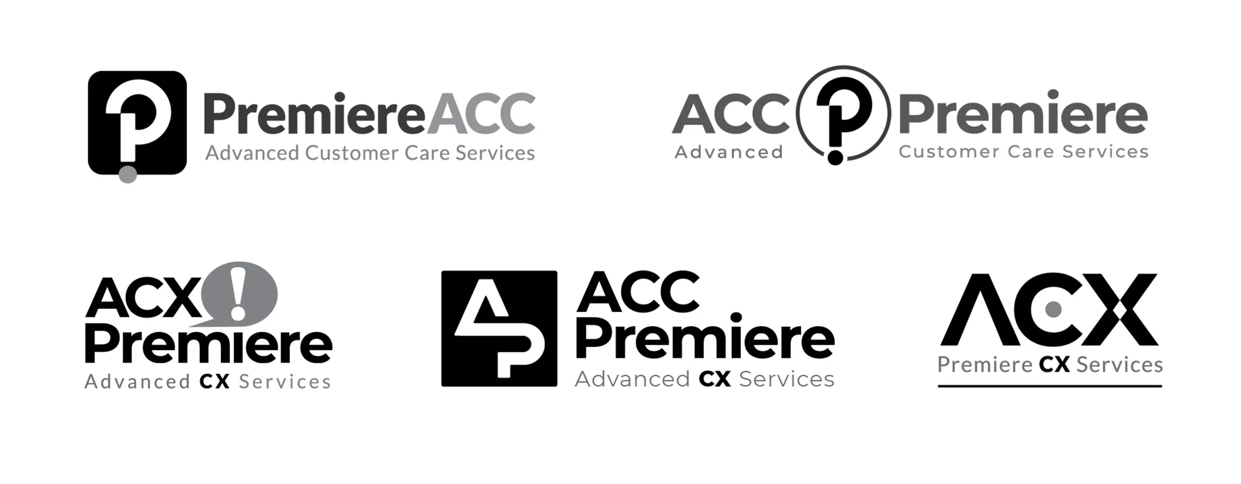
Design Exploration
Type styles, icons and naming were all open for exploration, with the goal of creating a bridge between the 2 existing brands and the new brand, imbued with all the qualities that would promote the desired pillars. 5 rounds of design iterations were conducted before arriving at an approved brand mark.
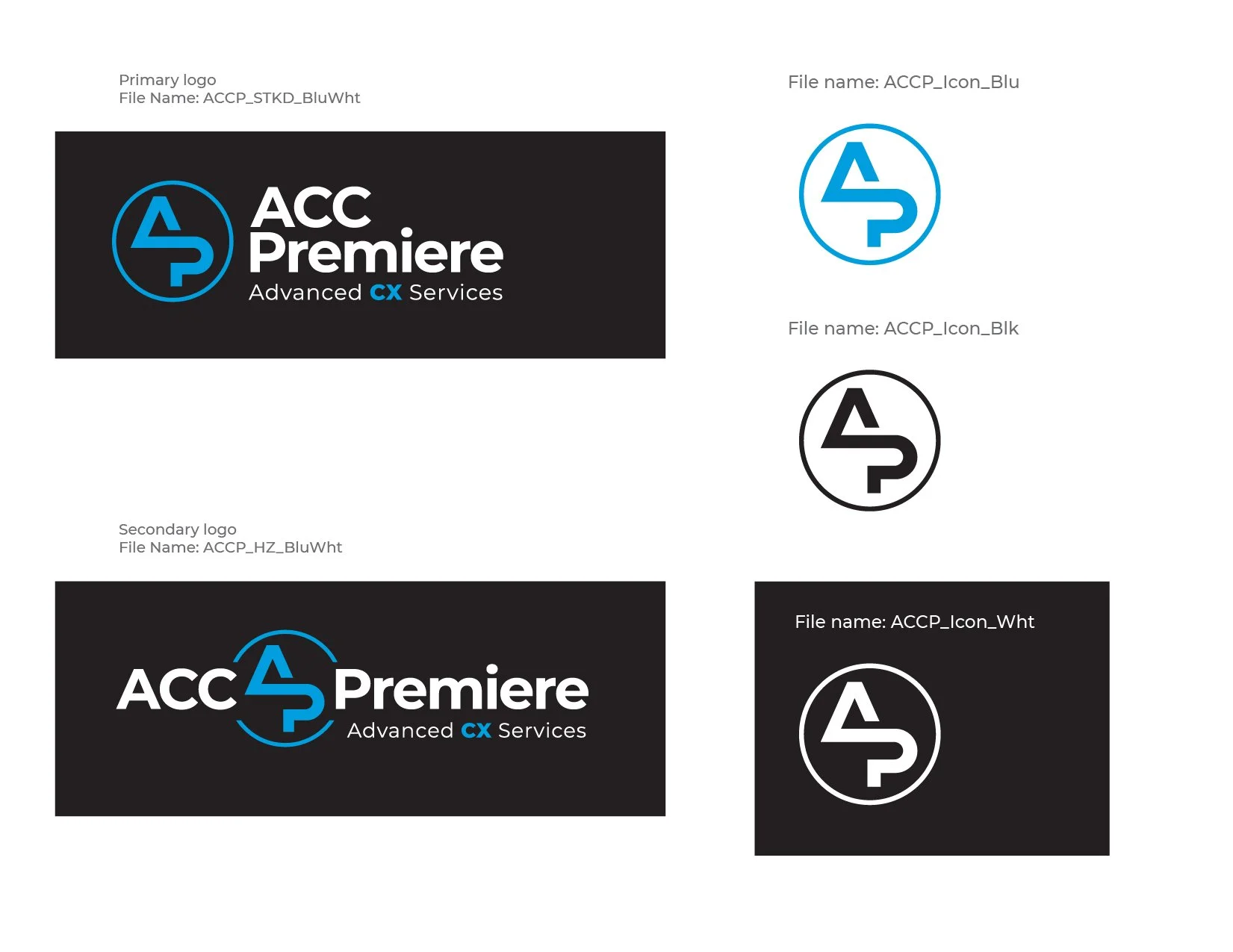
Final Logo Design
A final style guide was provided which included logos in all approved color configuration, and in all standard formats.
Accompanying Materials
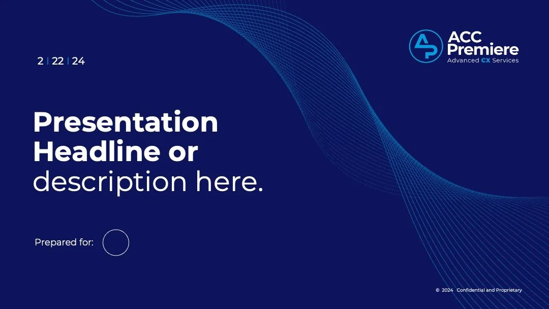
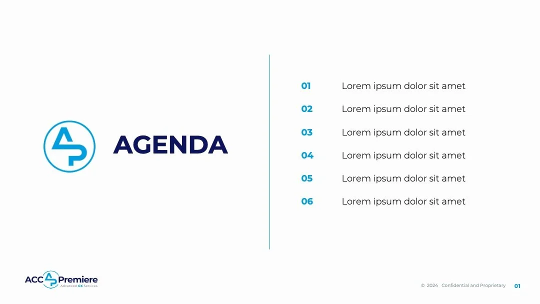
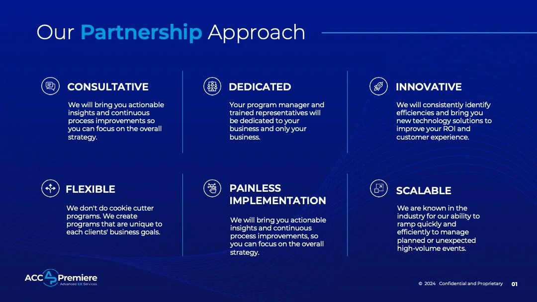
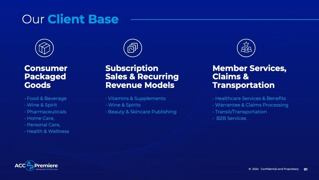
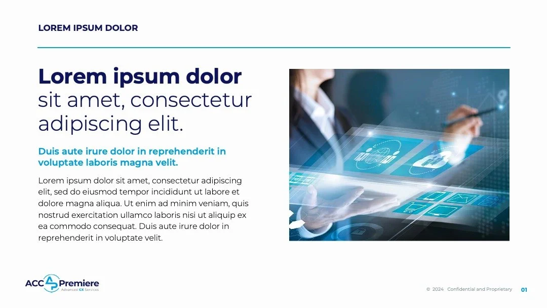
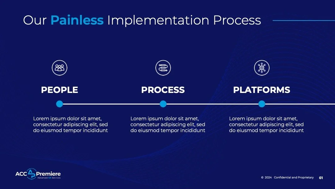
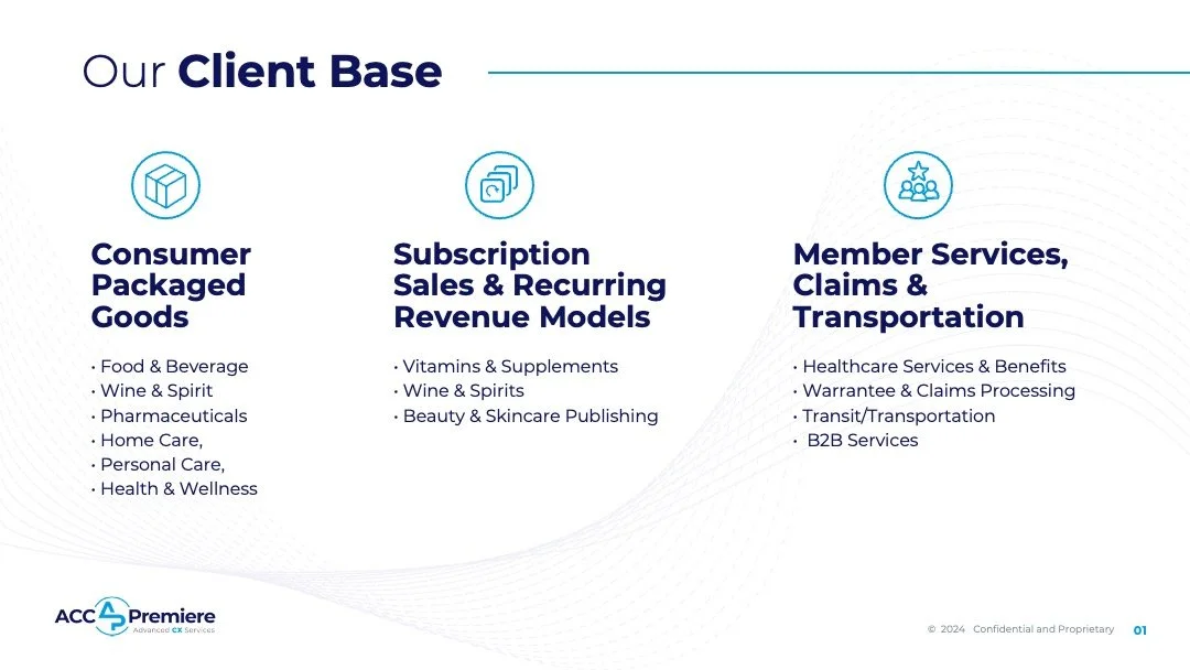
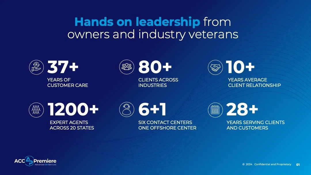
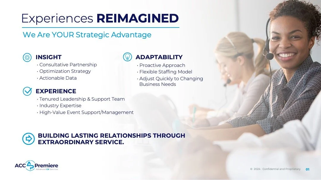
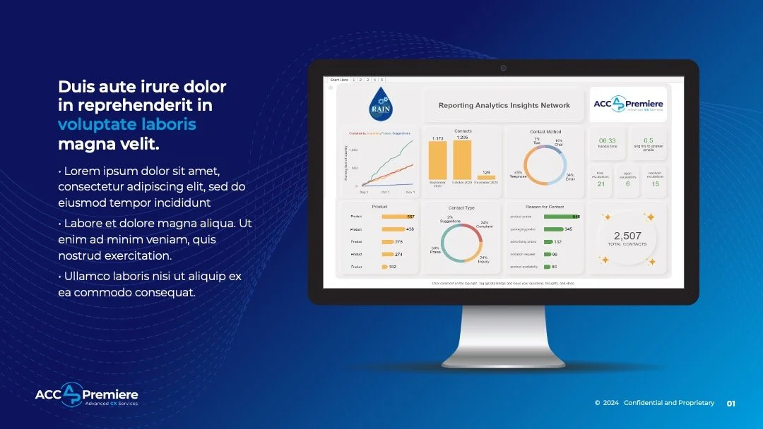
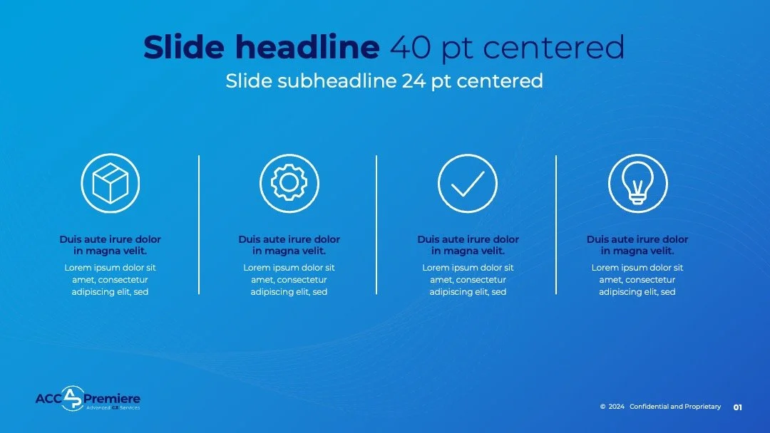
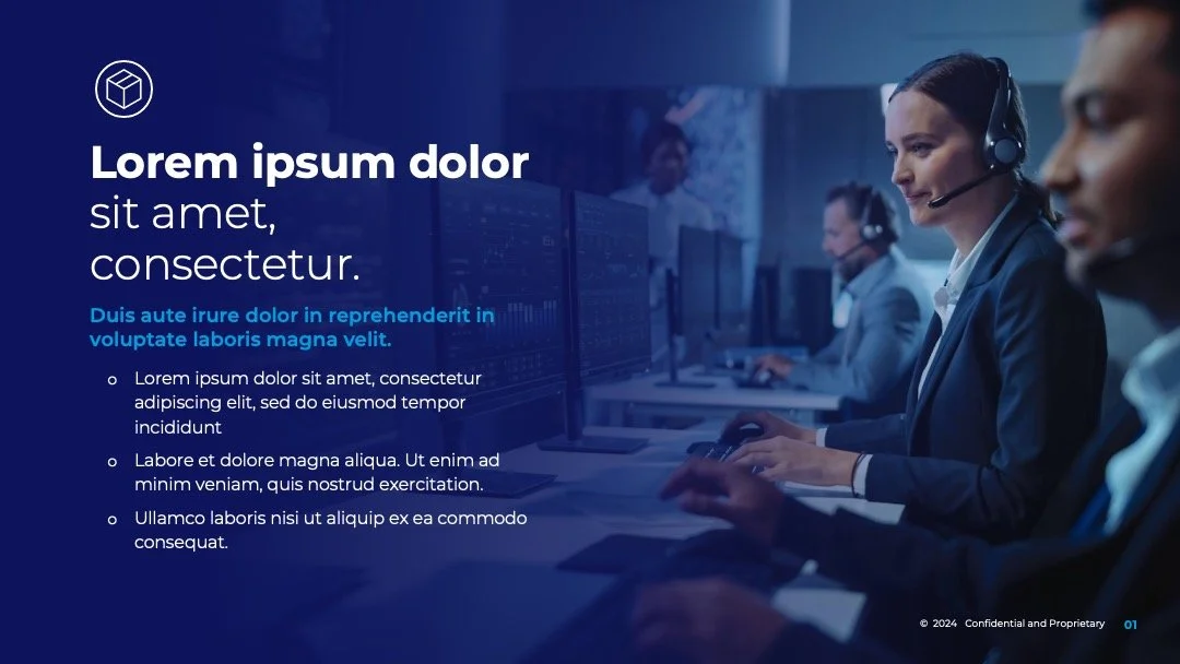
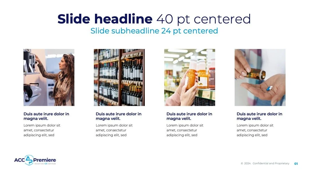
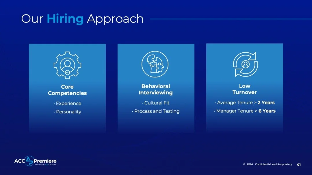
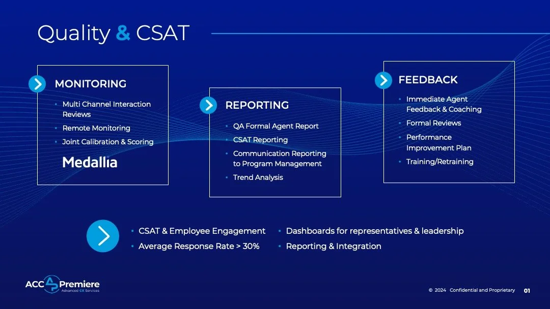
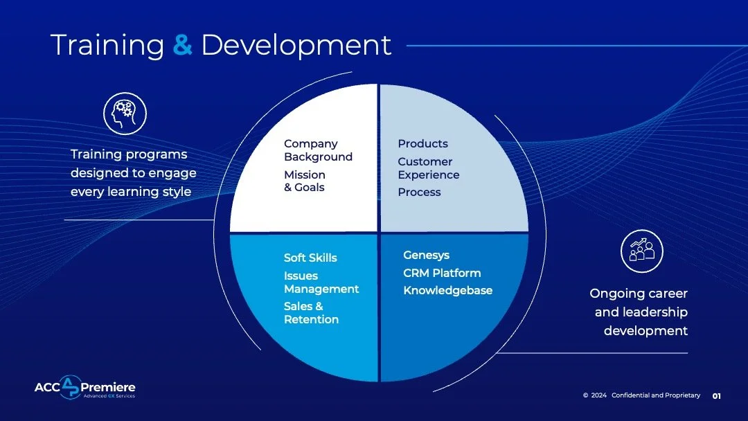
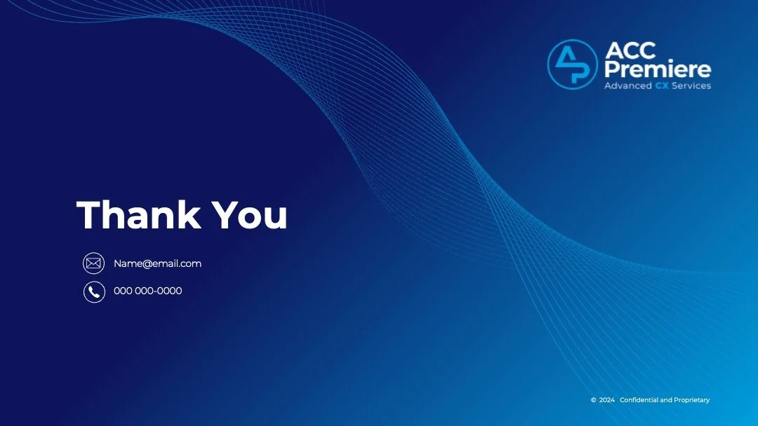
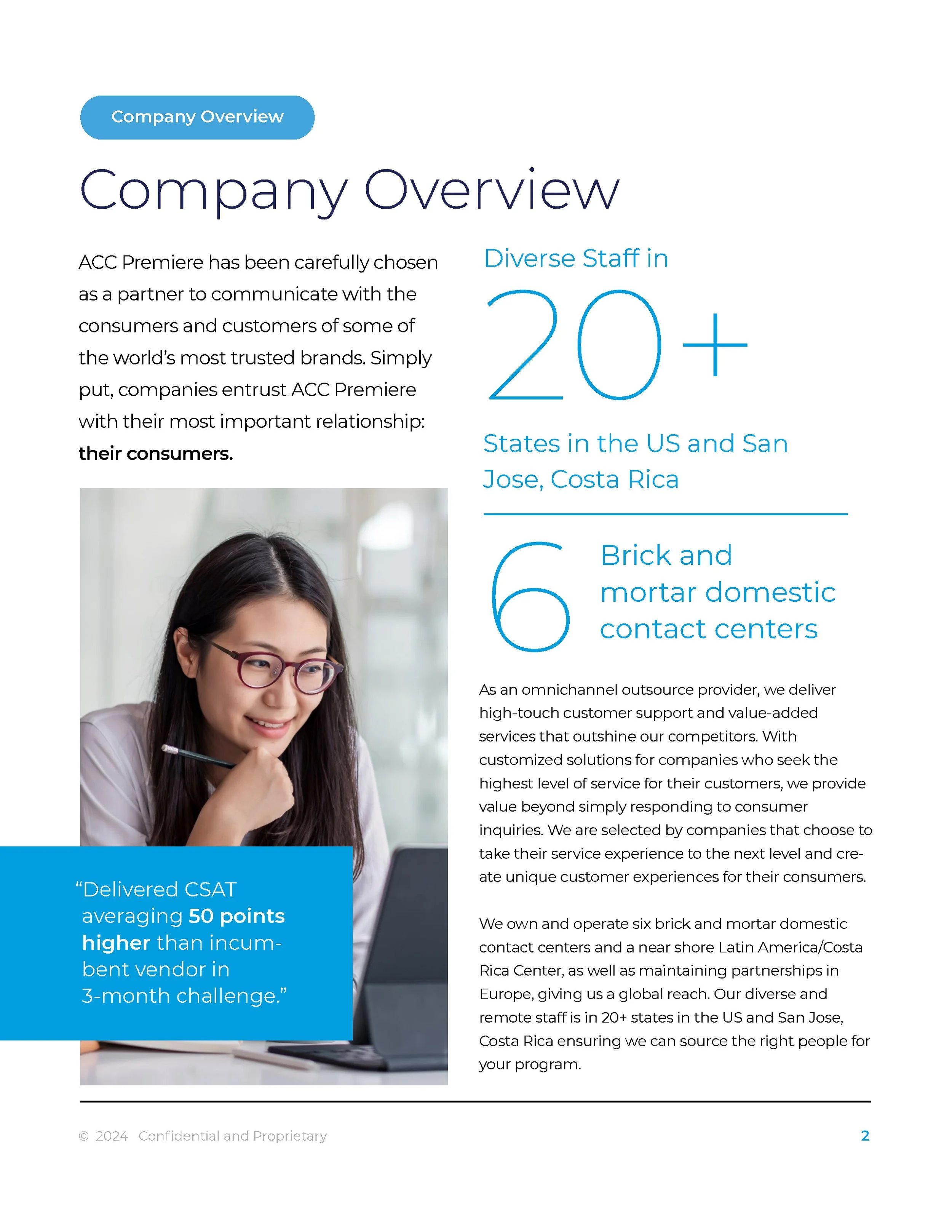
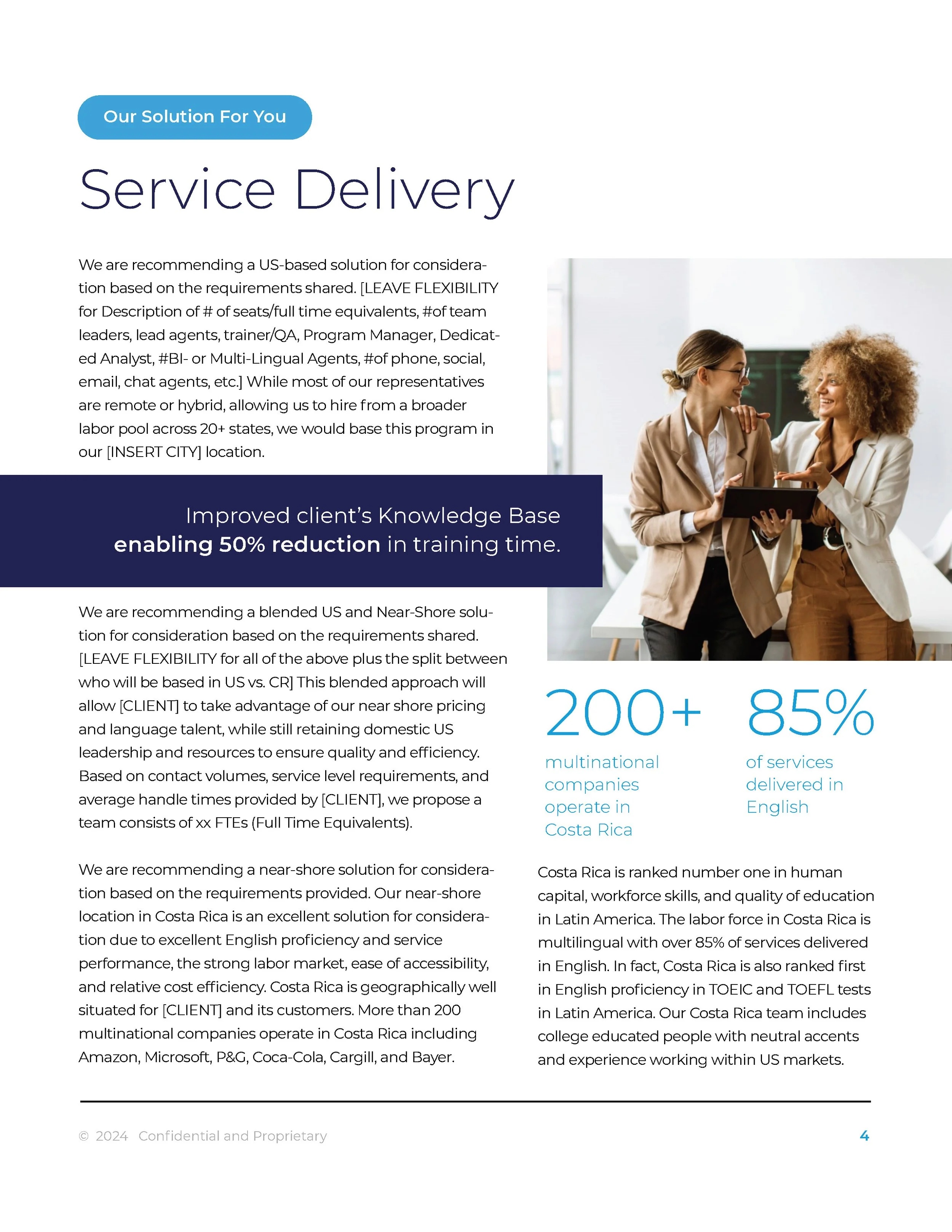
In addition to the new brand, a complete suite of marketing materials were developed which included a completely redesigned website. PowerPoint Presentation and corporate document templates.
PowerPoint Presentation
Corporate Documentation
WWIRE Brand Design
Original logo pre redesign
The assignment was to redesign the existing brand as part of total rebrand campaign, that included logo, website, video and other marketing materials. The new brand needed to reflect empowerment of women in the workplace while maintaining elements of the old brand so that members and prospects familiar with the organization would feel a continuity from the old brand to the new.
Design Exploration
A variety of type styles, colors and icons were explored. The lotus symbol was maintained as a representation of wellness, but the style was modernized. The logo includes 2 W characters that were confusing and hard to read I the original. Considered solutions needed to make that character set more readable and understandable. The original logo used a type style that was thin and weak when used at smaller sizes. Type styles were suggested that created a stronger visual presence when used in positive or negative applications.
Final Design
SpinUp Brand Design
As the newest entry into the crowded Simple Cloud Provider space, what was to become “SpinUp”
needed a brand name, logo and multi-touch campaign to drive interest and subscribers.
Brand Name/Logo Design
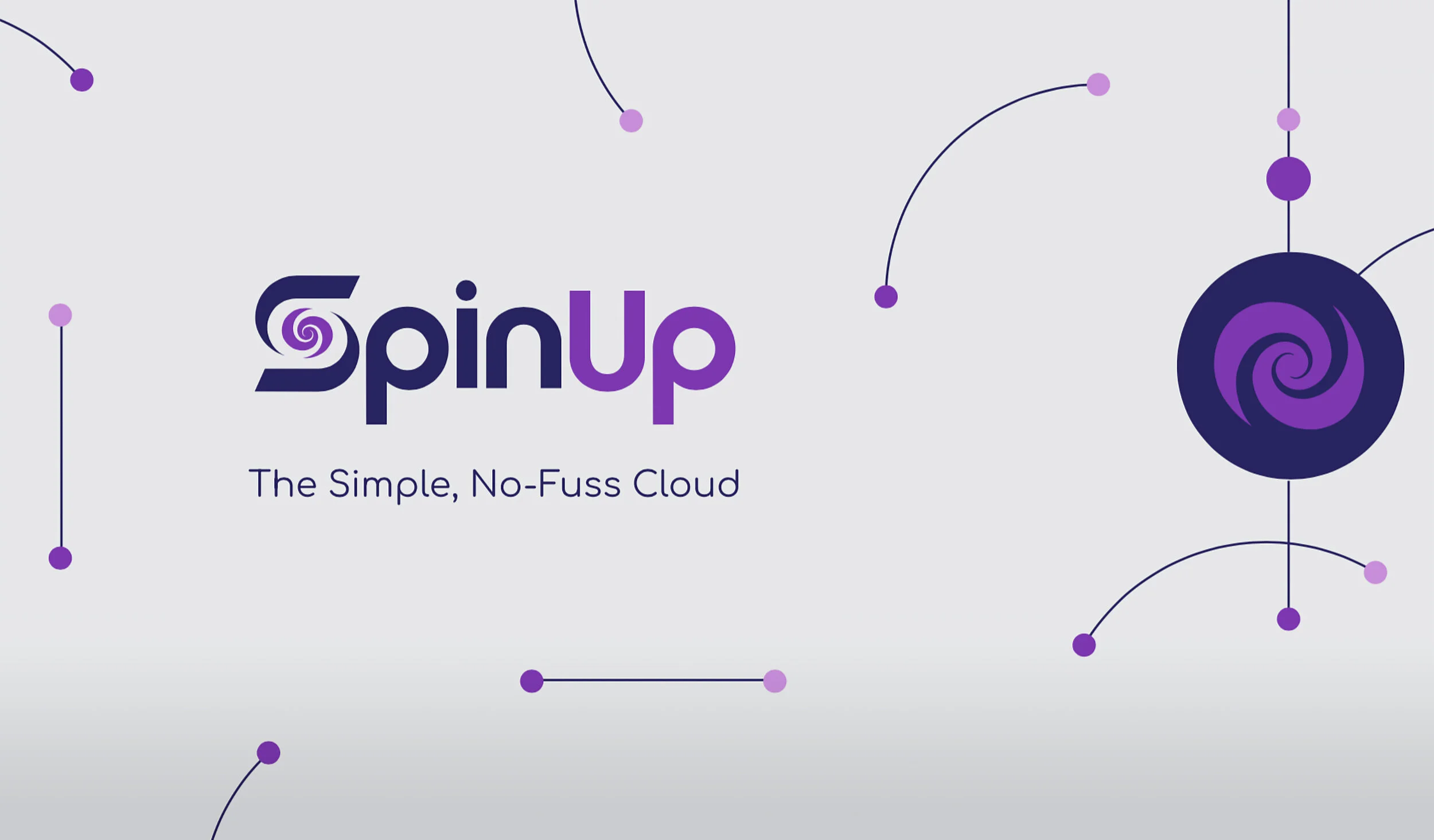
A broad range of names were presented, with ‘SpinUp’ selected as final. It has the double connotation of a startup business and a reference to ‘spinning up’ a new server. A range of logo designs were developed and presented, all representing the brand position in different ways. A final direction was selected and full logo set developed.
Expand style guide, establish social media presence
A visual library was developed for the new SpinUp brand and applied to relevant social media platforms.
Acquisition Campaign
With the brand established, a robust campaign was put into market to drive awareness and subscriptions.
TechData “STORAGE IQ” Brand Design
TechData was launching a new VAR training enablement series called “Storage IQ”. The brand for this program needed to have a look and feel that is representative of the content being shared while remaining exciting and captivating.
CONCEPT ONE: Design combines tech imagery in the shape of a brain, communicating technology and education.
CONCEPT TWO: IQ letters configured into cloud icon
CONCEPT THREE: This design promotes the idea of enabling conversation to elevate tech learning
CONCEPT FOUR: Circles represent knowledge defining a human profile
FINAL DESIGN: Storage and IQ combined in a vertical orientation gives the brand a unique presence
Atari Rebrand
With the acquisition of the ATARI brand by Infogrames, the case was made to change the US operations name officially to Atari as it offered premium brand recognition over the little known french gaming company. The reborn Atari needed to reconnect with the gaming public and help them understand what this long sleeping icon stood for in a new era of video games. A new brand mark was developed along with a series of promotional pieces including posters, websites, in-store and broadcast were developed using the iconic Fuji symbol, designed to breathe new life into the Atari name.
Promotional posters were designed to appeal to every segment of gamer - hardcore RPG to skater/sport to kids, and everyone in between.
Atari's mission was to publish gaming content across all devices and for all audiences - from Hasbro branded properties like Scrabble and Monopoly to classics like QBert and Missile Command to next-gen driving games like Need for Speed. To communicate this, we developed the tagline "Everybody Plays".
A new ATARI brand mark was developed along with a thorough style guide to inform on usage for all mediums
Atari Brand presentation prepared and presented to senior management, making the case for a company rebrand under the Atari name.


